Gudang Baru Berkah — The Quiet Standard of Kretek
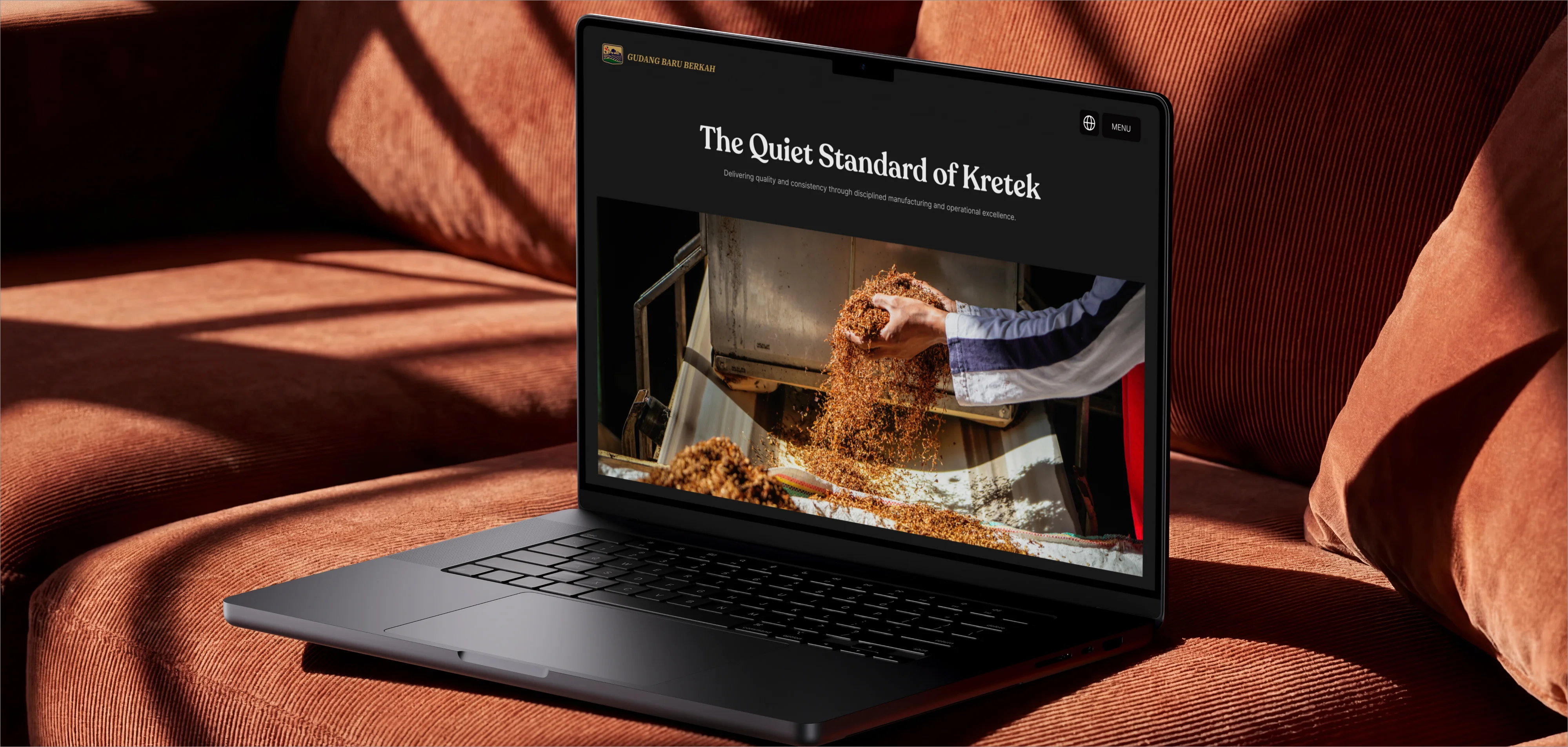
A UX and brand strategy to close the gap between a 35-year manufacturer's internal reality and its tier-2 digital surface, repositioning a factory as the standard setter for its own category.
01Impact first
PT Gudang Baru Berkah is more advanced, more disciplined, and more ambitious than its digital surface ever showed. Online, buyers and distributors met a tier-2 factory footprint. In reality, this is a house with 35 years of heritage, four factories, and a decade of exports.
The strategy was not to look more expensive. It was to become the most respected operator in its actual category. We reframed the whole engagement around one move: from a local tier-2 factory online to the standard setter for its tier. Every decision that followed- the language, the structure, the restraint- served that single repositioning.
"Pemain kuat di segmen tier 2 dengan ambisi kualitas setara tier 1." A strong tier-2 player with tier-1 quality ambition. — Pak Sobir
02The problem
The gap is the business risk. Until the surface matched the internal reality, the company kept negotiating from a weaker position than it deserved. New audiences now meet the company through a screen, not a handshake, so the website is no longer a brochure. It is the first impression that sets the terms of every conversation.
Three truths defined the brief:
· New audiences meet the company digitally, not personally.
· Authority built over decades must translate into pixels.
· This is not a sales venue. It is the gateway to trust.
03What they told us
We started by listening, not designing. Four themes ran through the interviews with the people who built the house:
· Relationships. Distributors kept across generations in Madiun, Batam, and beyond. Trust built over decades, not per transaction.
· Heritage. Relationships began around 1991, first product in 1992, own machinery since 1996. Four factories today, 35 years on.
· Recipe discipline. More than seven flavor iterations led by Pak Ali Kosin, with patience measured in years. Craft, not haste.
· Resilience and export. Survived the Gudang Baru to Gajah Baru transition, roughly ten years exporting to Malaysia and the Philippines.
The direction was already in their own words. Our job was to set it, not invent it
04What I led
I led the strategy end-to-end through a Design Thinking arc: empathy interviews with leadership and distributors, the reframe that set positioning, the ideation of voice and visual system, and the prototype structure for launch.
We learned from world-class houses without copying them. The principle was to take the posture, leave the register:
· David Brown Automotive — take the cinematic, atmospheric calm; leave the niche enthusiast tone.
· Patek Philippe — take the detail-led storytelling and generational respect; leave the Swiss-European register.
· BAT — take the future-facing posture for ESG and careers; leave the sterile blue aesthetic.
· JTI — take the corporate IA and governance tone; leave the global-corporate gloss.
· Victorinox — take the precision and heritage-with-utility; leave the consumer-retail framing.
The result had to be unmistakably Indonesian and unmistakably theirs.
05Key strategic decisions
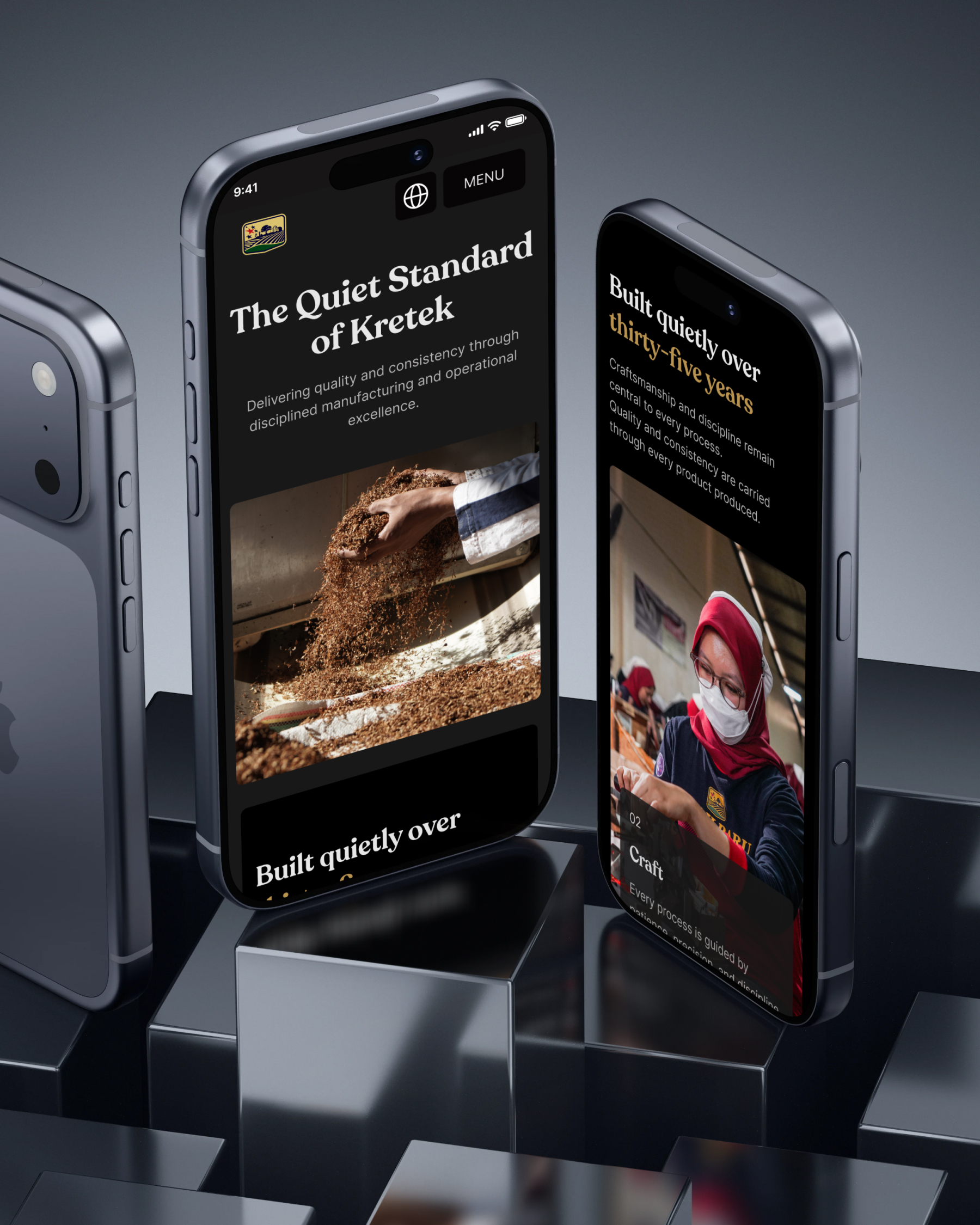
· One brand line, three registers. A tagline trio, each for its right context: "A trusted Indonesian kretek manufacturer built on heritage, quality, and long-term partnership" for B2B and export; "The Quiet Standard of Kretek" as the master website headline; and "Warisan rasa kretek Indonesia, dibangun dengan integritas, kualitas, dan komitmen jangka panjang" for Indonesian-first touchpoints.
· Tell the transition as integrity, never as loss. The move from Gudang Baru to Gudang Baru Berkah came through a trademark dispute. We framed it as a house that kept its standard through change, with the new identity registered as protected IP. Never as a legal defeat.
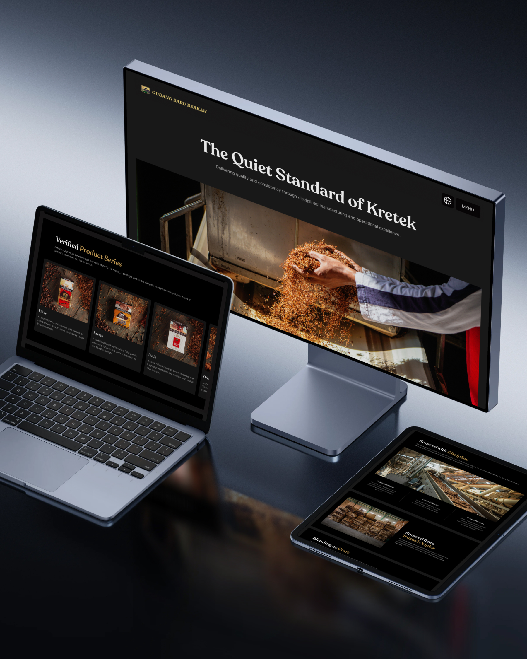
· A design system of "Warm Restraint." Indonesian material truth: heritage through detail, premium through space, modern through precision. Calm and confident, never cold. Palette below.
· One action per page. Zero CTAs across homepage sections one to five. Only one moment asks to talk, because confidence does not ask twice.
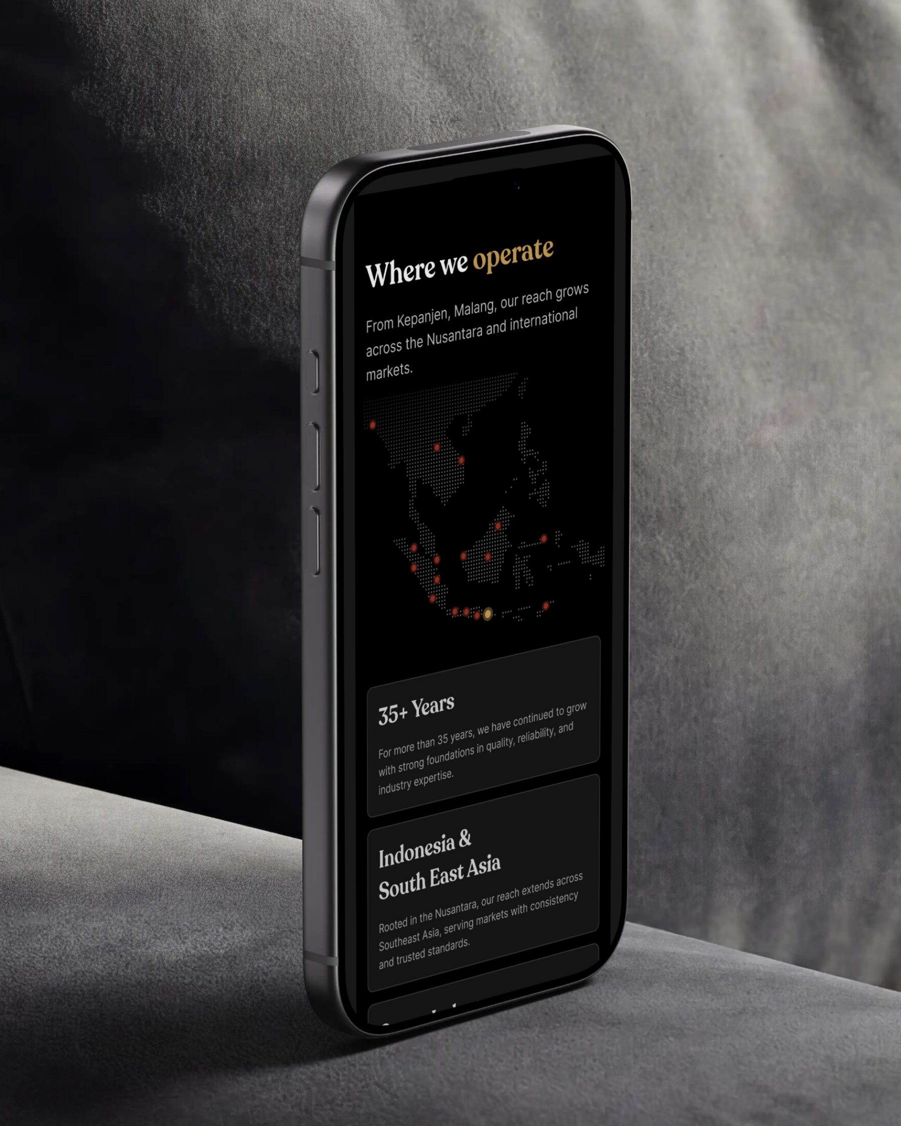
· Number discipline. Fewer than ten numbers site-wide. Only 35 years, 4 factories, 2 export markets, and about 10 years exporting. Scarcity makes each one land.
· The owner stays off the public site. By the client's choice, the brand becomes bigger than one person. Production volume and smoking imagery are deliberately withheld, by regulation and on principle.
Structure (figure caption): 16 pages, six sections. Our House, Craft & Quality, Sustainability, Global Reach, Careers, and Contact, with the homepage moving from a five-second atmosphere hero to a single invitation to open a conversation.
06Reflection
The hardest calls were about what to leave out. A metric strip in every section, an owner portrait, an e-commerce push: all were available, all were declined. Restraint was the strategy, because a house this established does not need to raise its voice to be believed.
The engagement confirmed something I keep returning to: for a company with real authority, digital design is not about adding polish. It is about removing everything that makes the surface read smaller than the truth behind it.
Let's build something that moves the numbers.
Need a product design lead for your team, or senior hands for a freelance project? Let me know what you're building and where it's stuck.