Good Doctor — Clinical Workbench Redesign
A six-phase design sprint to rebuild the internal tool GrabHealth doctors use for every online consultation, pulling the clicks, the open tabs, and the guesswork out of diagnosing and prescribing at scale.
01Impact first
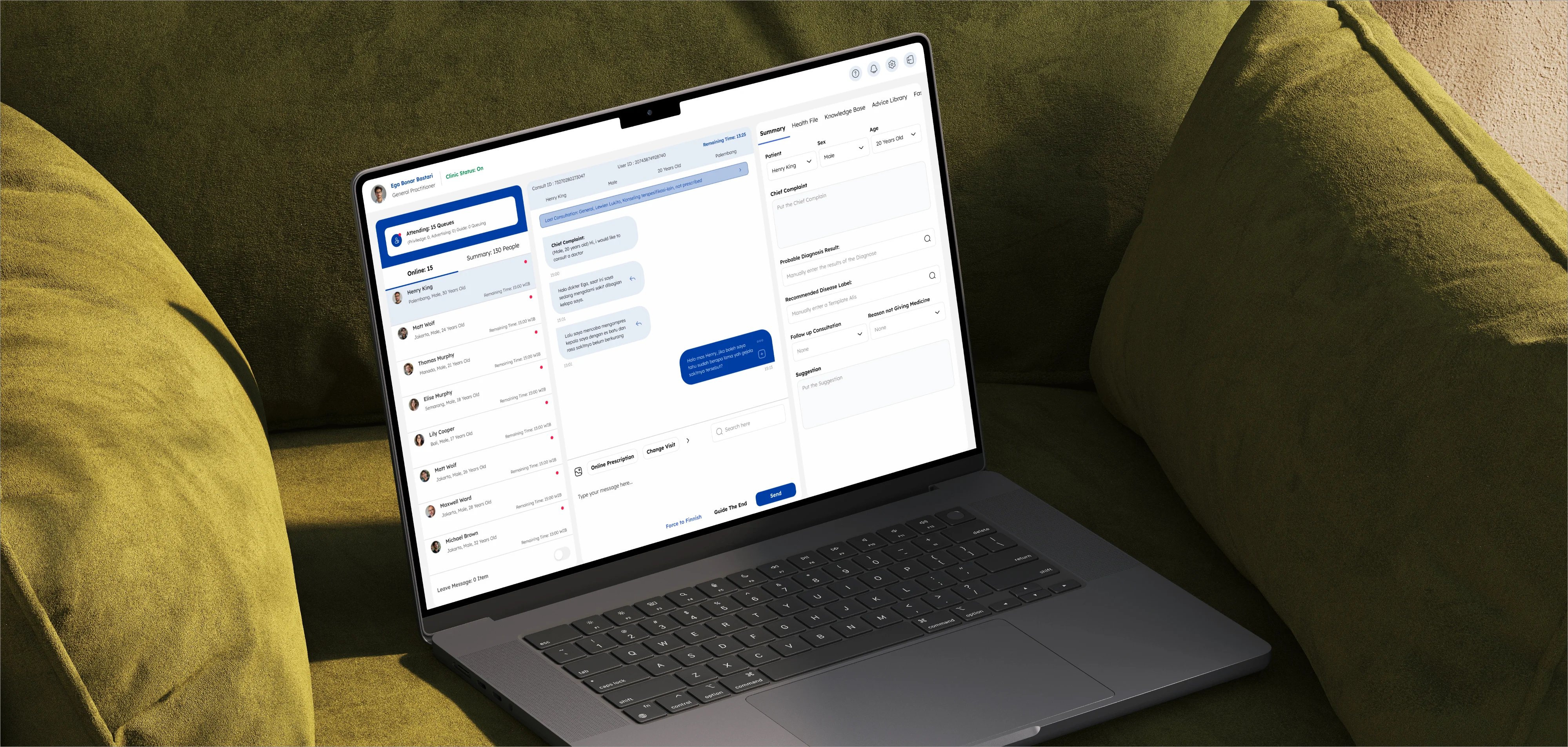
The old workbench worked. It just made doctors fight the tool instead of focusing on the patient: twelve clicks and six-plus minutes for a single prescription, patient details vanishing mid-scroll, drug searches that only revealed a stock-out at the final preview.
The redesign attacked the friction, not the features. Patient context now stays pinned through the whole consult, diagnosis is clickable instead of keyboard-only, and drug search knows what the nearby pharmacy has in stock before the doctor commits. In validation, 60% of doctors completed a full prescription in under four minutes, down from six-plus, and satisfaction moved from 3.4 to 4.6 out of 5.
"Feels more like how I actually work in a real clinic." — Internal doctor, validation session
02The problem
85% of doctors needed at least six minutes to send one prescription. The workbench asked them to do their most careful work in their least forgiving conditions: a live queue, a ticking timer, and a tool that fought back at every step.
Diagnosis demanded the keyboard. ICD-X codes couldn't be clicked, mixed English and Bahasa, and weren't WHO-standard, so doctors kept a Google tab open to look them up. Drug search returned every medicine from every nearby pharmacy even when only two matched, and stock-outs surfaced only at the preview step. Patient details disappeared the moment the chat scrolled, and there was no queue alert, no read receipt, and no way to fix a mistyped message.
"I open at least four windows and still feel unsure if I missed something." — Internal doctor, discovery interview
03What I led
I ran a six-phase sprint process with clinicians as co-designers: interviews with internal doctors, log analysis from 34+ users, and a full journey map from opening the clinic to sending prescriptions. The highest-impact decisions:
· Sticky patient context (photo, complaint, chat) that stays visible during scroll
· Clickable ICD-X auto-complete to replace keyboard-only diagnosis input
· Drug search filtered by live pharmacy inventory, saving 2-3 minutes per session
· Allergy fields defaulting to "None", removing four clicks from every consultation
· Real-time queue alerts and read receipts, borrowed from messaging patterns doctors already trust
04How we understood the work
We opened with one How-Might-We: how might we help internal doctors deliver efficient, high-volume consultations backed by a reliable health-supply channel? That split into three fronts: deliver efficiently, serve many patients at once, and make it easy to find in-stock drugs near the patient.
The method was stakeholder and doctor interviews, the 34-doctor survey, session and log review, and a full experience journey map across every step of a consult. Mapping the emotional journey exposed the real problem: the tool turned "prepared" doctors into "overwhelmed" and "frustrated" ones, most sharply at diagnosis and online prescription. Rather than invent personas, I anchored on the doctors' real KPI pressure. They're measured on serving more patients than the system's own cap, so every extra click compounds across an entire shift.
Synthesized insights (grid)
· "ICD-X translator isn't a WHO standard." Doctors hunted codes on Google because the in-app translation wasn't standardized.
· "The queue isn't clearly visible." Nothing signaled urgency, so waiting patients were missed.
· "The drug search is very confusing." Every pharmacy's stock appeared at once, even when only two options fit.
05What I led
I framed the HMW with stakeholders, designed and ran the survey and interviews, built the experience journey map, and drove a six-phase design sprint end to end, from wireframes to a low-fidelity prototype tested with real internal doctors.
The hard part wasn't drawing screens. It was reconciling what doctors wanted- speed- with what patient safety required: complete and correct prescriptions- inside a tool a busy clinical operation depended on every minute of the day.
Six-phase sprint (stepper)
· Understand: HMW, UX review, interviews
· Define: Journey map, personas
· Sketch: Wireframe flows
· Decide: Assumptions, sprint questions
· Prototype: Low-fi build
· Validate: Test with doctors
06Key design decisions
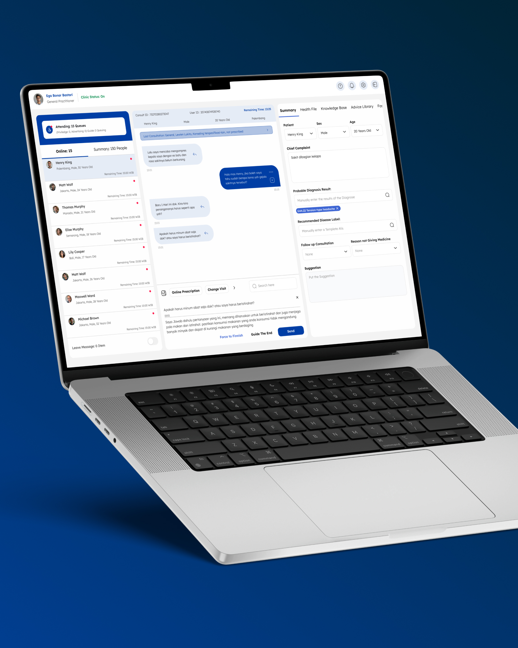
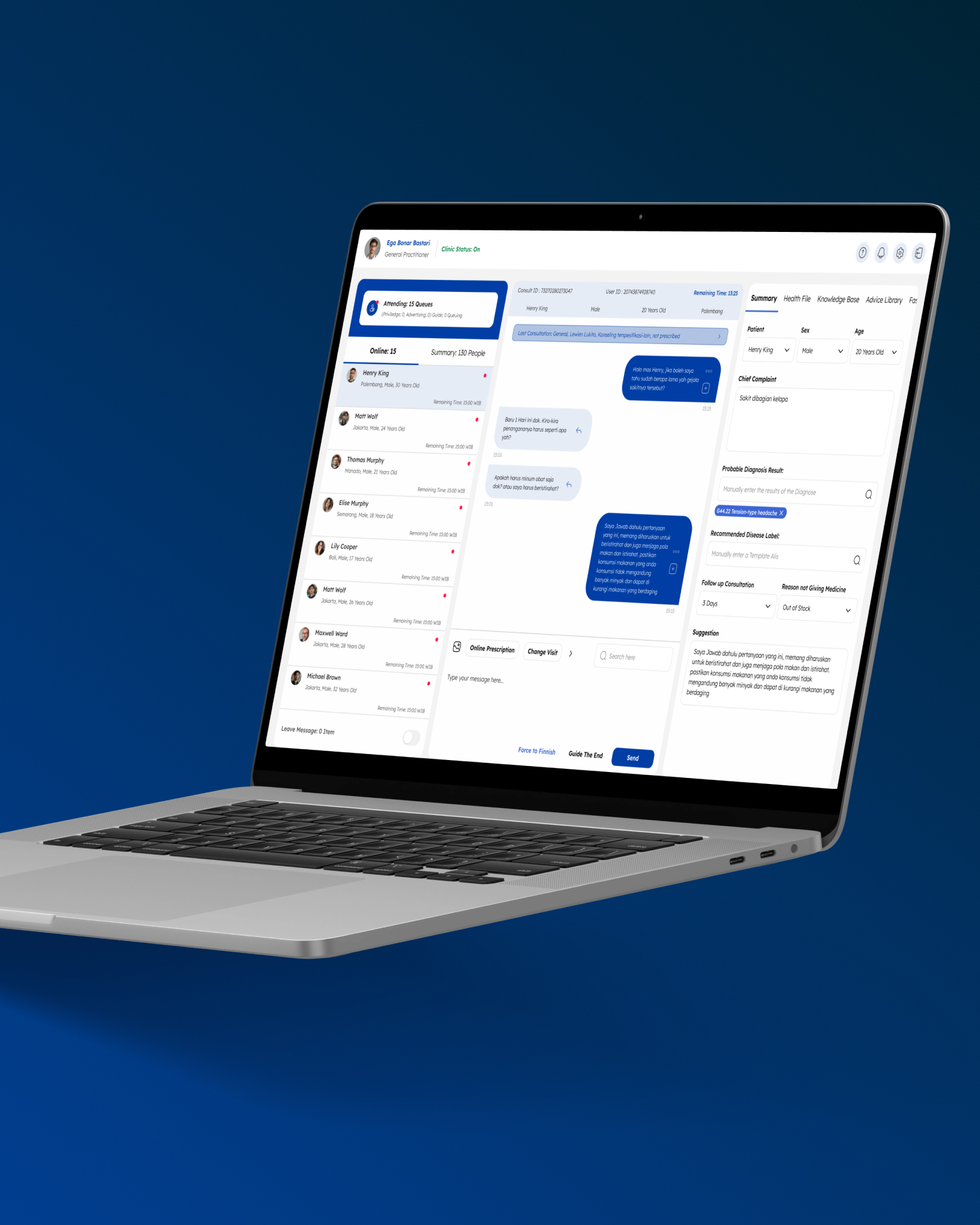
· Freeze the patient context. Name, age, vitals, allergies, and history stay pinned in the header so nothing disappears when the chat scrolls.
· Make diagnosis clickable. Standardized, WHO-aligned ICD-X with mouse-driven auto-complete, plus a knowledge-base entry that converts straight into a diagnosis, retiring the Google tab.
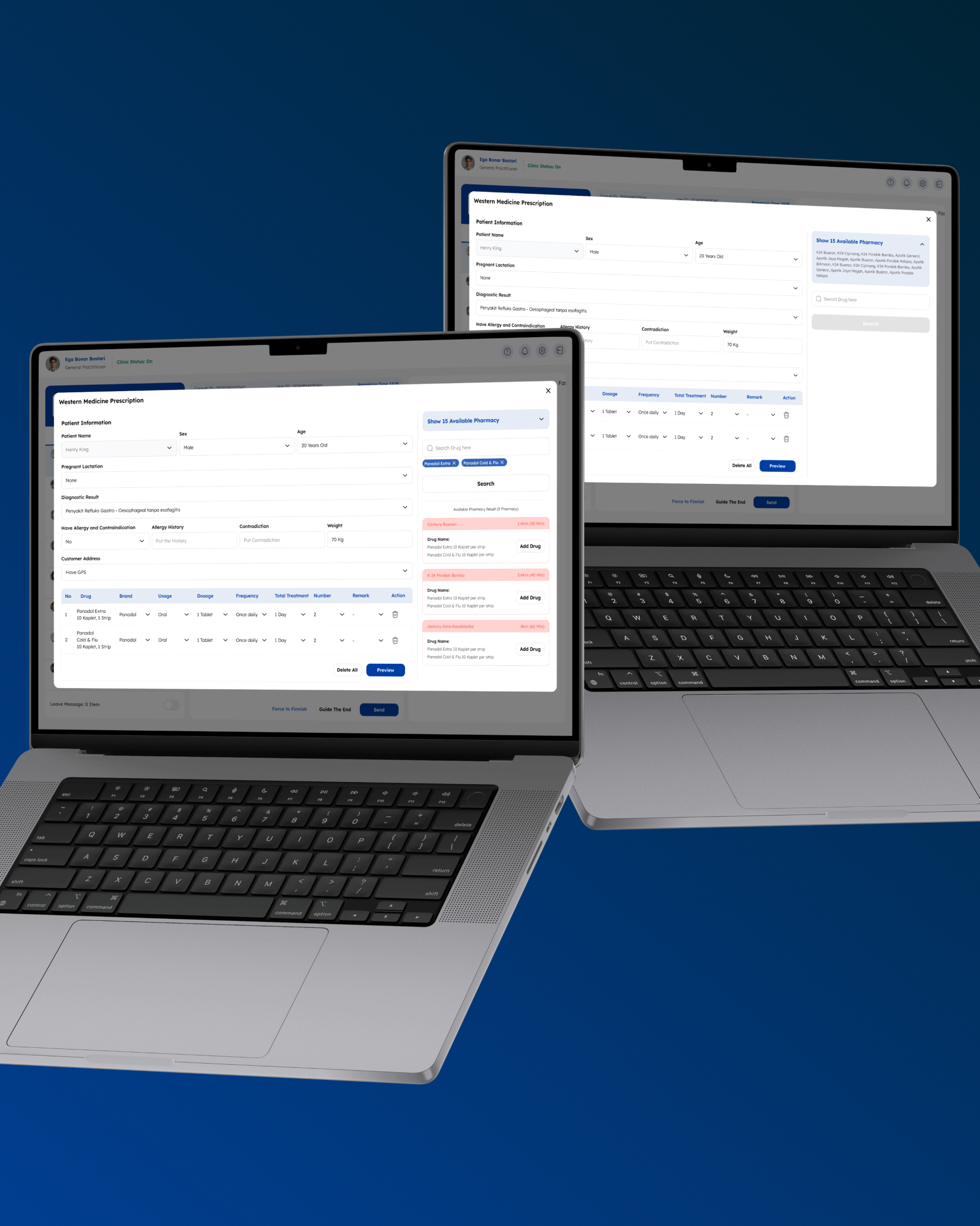
· Filter drugs by real stock. Enter up to three ingredients and see only the nearby pharmacies that have all three. Stock-outs surface before the prescription, not after.
· Default the safe path. Allergy and contraindication fields default to "none," cutting four clicks from every prescription for the majority of patients who have neither.
· Make the queue impossible to miss. A visible queue count with a sound alert, plus read receipts and editable messages, so doctors know who's waiting and what's been seen.
· One screen, no pop-ups. Prescribing happens inline instead of behind an oversized modal that hid incoming patient chats.
Figure captions (for your screens):
· Diagnosis, clickable. A standardized ICD-X picker doctors can drive with the mouse.
· Stock before commitment. Three ingredients in; only the pharmacies that carry them show.
· Patient context, pinned. Vitals, history, and allergies stay in the header through the entire consult.
07Reflection
"Healthcare tools don't need flashy UI. They need to be a quiet, reliable space for decisions that affect patient safety."
The biggest wins weren't new features; they were removed friction and cleaner language. Uniforming the ICD-X wording and defaulting fields to "none" did more for speed than any visual polish, and collapsing four open windows into one workflow changed how a whole shift felt.
Treating doctors as co-designers, not just interview subjects, was what made it land. They knew exactly which twelve clicks to kill and why. If I ran it again, I'd instrument the workbench from day one, so every "faster" claim had a number behind it before rollout, not just after.
Let's build something that moves the numbers.
Need a product design lead for your team, or senior hands for a freelance project? Let me know what you're building and where it's stuck.