Alodokter — UX Overhaul at 30M MAU Scale
Restructuring Indonesia's #1 health-tech platform: paid-feature adoption tripled, booking time down 45%.
01Impact first
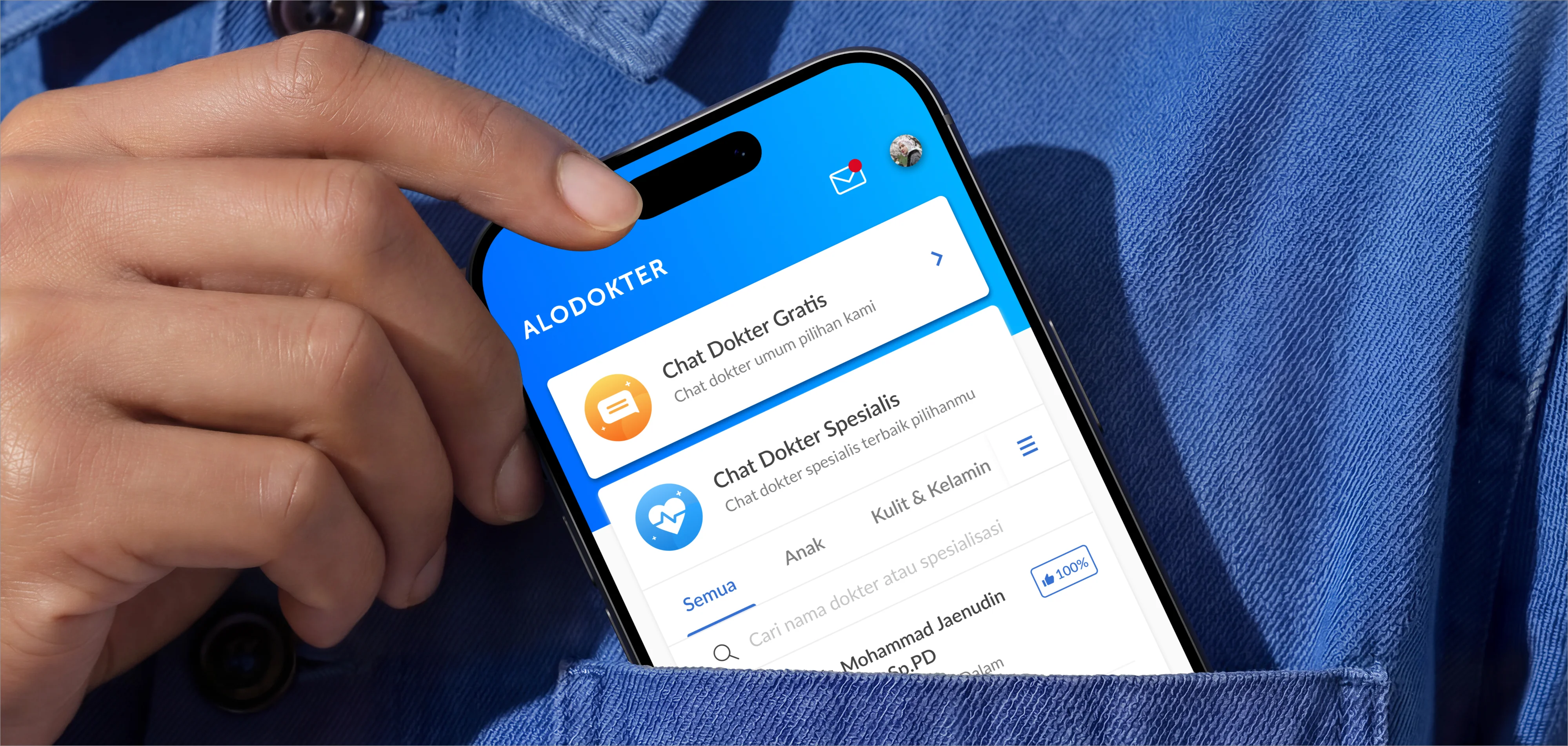
Alodokter is Indonesia's #1 health-tech platform, and in 2018, it was growing faster than its UX could carry. The restructuring I led tripled paid-feature adoption (+300%), cut consultation booking time by 45%, and supported growth to 30M monthly active users and 80K doctors. No flashy redesign, no new brand. The wins came from information architecture: putting the right feature in front of the right user at the right moment.
02The problem
Alodokter served two audiences with opposite needs through one fragmented experience. Patients wanted quick answers, a doctor they could trust, and an appointment without friction. Doctors on Alomedika needed professional tools that didn't feel like an afterthought. Meanwhile, the business needed paid features to grow, but those features were buried so deep that most users never met them. Every funnel we mapped leaked at multiple steps. Traffic kept climbing; conversion didn't follow.
03Finding where growth was hiding
I started with end-to-end UX audits instead of a redesign wishlist. We walked every journey a patient could take, from a symptom search at midnight to a booked appointment, and logged where each one stalled. The pattern was consistent: the product had the right features in the wrong places. Paid consultations appeared as a destination users had to seek out, instead of an option offered at the exact moment someone was reading about a symptom and wanted to talk to a doctor.
04What I led
· A unified experience architecture across the patient platform (Alodokter) and the doctor platform (Alomedika), so both sides finally felt like one product
· End-to-end UX audits that exposed usability gaps and re-prioritized the roadmap with Product and Marketing
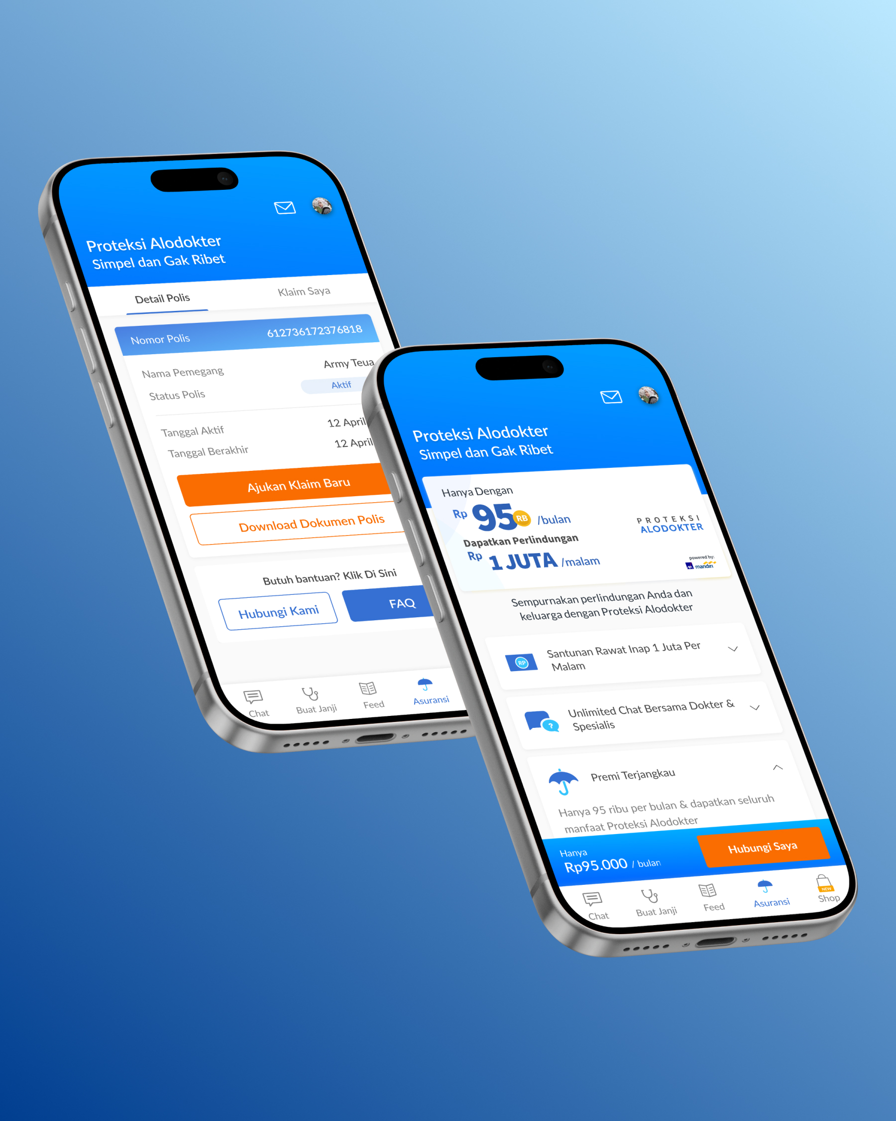
· Navigation and IA restructuring that surfaced paid features in context, the direct driver of the +300% adoption
· Iterative optimization of the appointment booking flow, shipped across web and mobile with Engineering
05Key design decisions
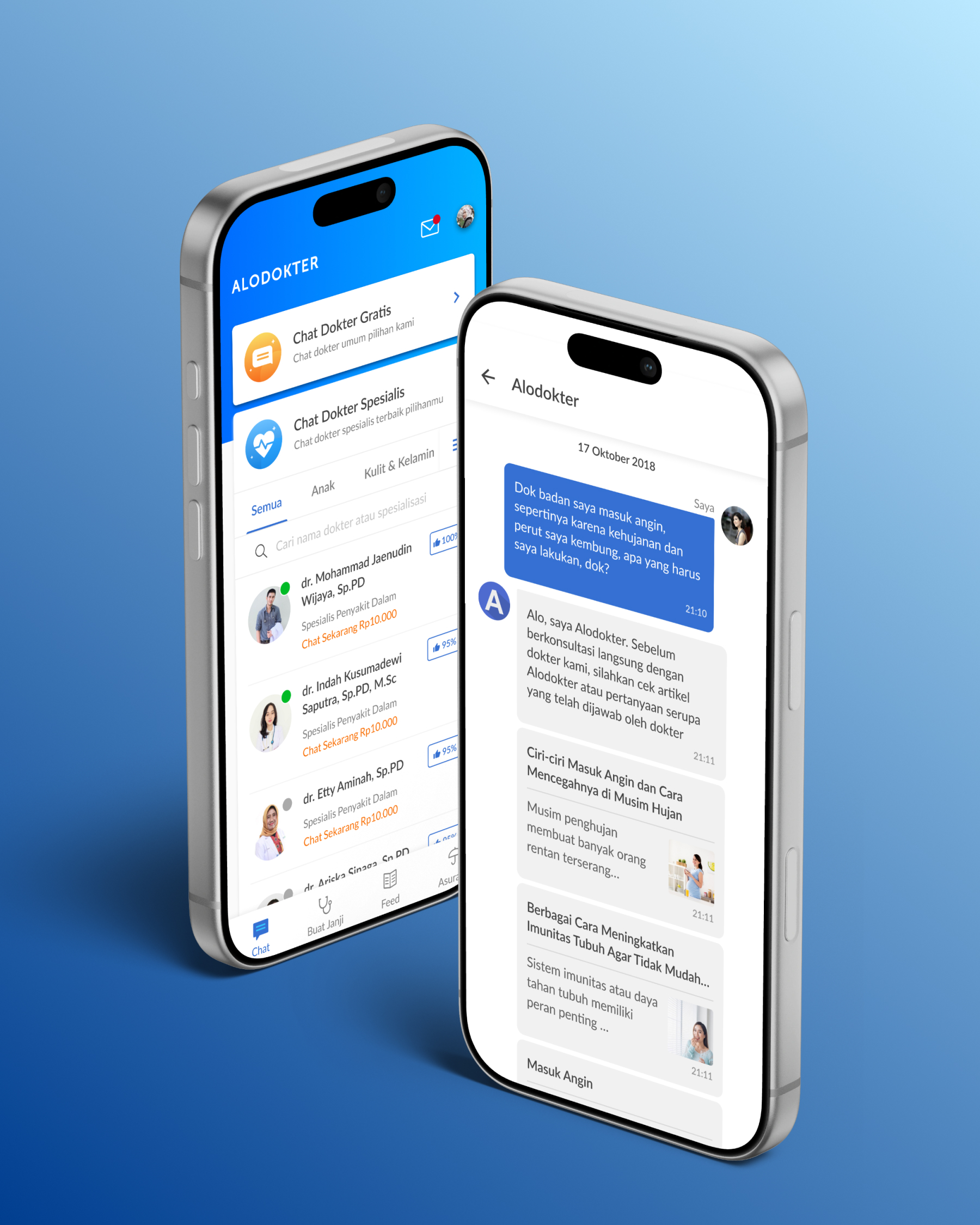
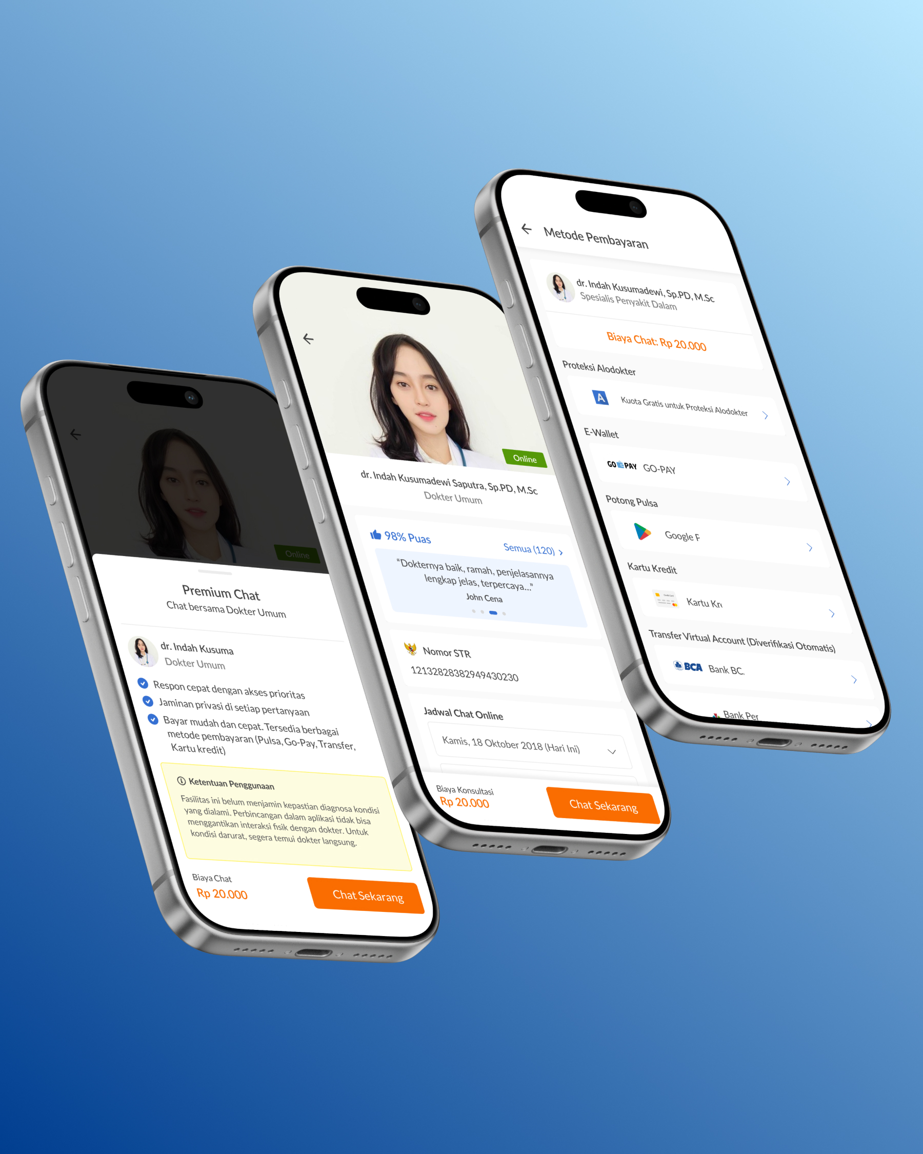
· Paid features moved into the journey, not the menu: a consult option surfaced where intent peaks, like at the end of a symptom article. Same feature, new placement, triple the adoption
· Booking rebuilt around fewer decisions per screen: pick a doctor, pick a time, confirm. Cutting decision points brought booking time down 45%
· One design language across the patient and doctor sides, so a pattern shipped once could be reused everywhere
· Discovery reorganized around what users were trying to do, not around the company's org chart
06Shipping at 30M MAU scale
At 30M monthly active users, there is no such thing as a small change. Every iteration shipped gradually, was measured against the funnel, and could be rolled back. That discipline shaped how I've led ever since: we restructured the platform piece by piece, week by week, while millions of people kept using it, and most of them never noticed anything except that things got easier.
07Reflection
This is still the project I measure others against. It taught me that growth problems are usually architecture problems wearing a marketing costume, and that the most valuable design work is often invisible: nothing new to look at, everything easier to find.
Let's build something that moves the numbers.
Need a product design lead for your team, or senior hands for a freelance project? Let me know what you're building and where it's stuck.